Client project
EquinoxDENTISTRY
Familiar, welcoming, connected
A connected presence.
A real practice, a refreshed website and a creative direction that carries the same character into social content, campaign banners and print.
Explore the applications ↓Dental care,
made easier.
CLIENT PROJECT / 06
Dentistry @ Equinox is a real practice. Reception and campaign placements are design mockups. Portrait and campaign models are illustrative, not Equinox dentists, staff or patients. Proposed creative remains subject to clinic review.
01 / THE VISUAL LANGUAGE
Familiarity,
in every detail.
The existing logo, deep teal, warm sage and linen connect the website with each new application.
#183E49#C7CEC1#DBC8B1A clear opening.
A softer continuation.
Two-tone headlines, plain language and room for people.
Welcoming. Useful. Clear.
02 / DIGITAL FIRST IMPRESSION
A familiar place
to begin.
The clinic’s identity and website copy, presented in the same desktop frame as the other projects. This is a presentation mockup; its internal controls are illustrative.
 Our care / Plan your visit
Dental care,
made easier.
Your family dentist near Scarborough Town Centre.
Request an appointment ↗
Website presentation with campaign concept imagery · View the live clinic website ↗

FAMILY CARE
Care for
your family.
Family care · creative direction
Instagram presentation mockup · proposed creative, not a live post or engagement report.
YOUR VISIT
Room for
your questions.
Your questions · creative direction
Instagram presentation mockup · proposed creative, not a live post or engagement report.

THIS CHRISTMAS
A little time.
For your family.
Christmas · creative direction
Instagram presentation mockup · proposed creative, not a live post or engagement report.
04 / CAMPAIGN BANNERS
The same message.
A wider canvas.
Existing first-visit and seasonal banner designs pair live type with a continuous photographic setting. These are creative concepts, with illustrative calls to action.
YOUR FIRST VISIT
New here?
Start with hello.
Let’s help you plan your first visit.

THIS HOLIDAY SEASON
Make room
for your next visit.
Planning ahead? Let’s find a time.

05 / PRINT & BRAND APPLICATIONS
A small introduction.
Worth keeping.
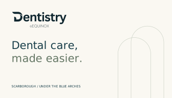
Four existing front-and-back card directions carry the clinic’s identity into something tangible. Review artwork; production details and physical proofs remain to be confirmed.



06 / ONE CONNECTED IDENTITY
From the first scroll
to the front desk.
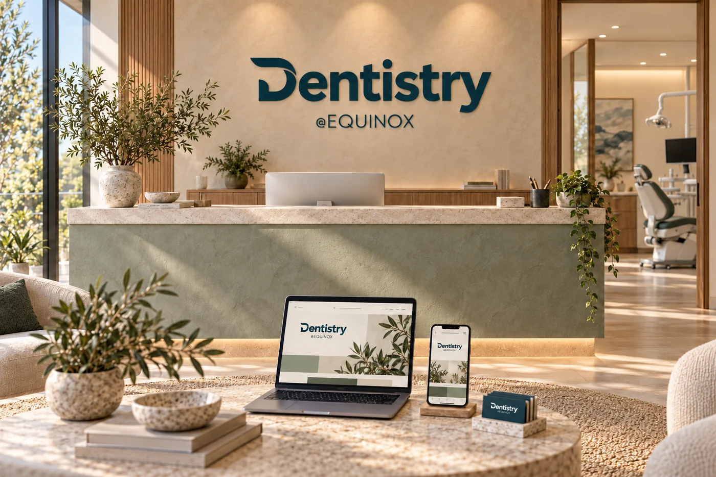
A reception design mockup explores how the same teal, sage and original logo can connect the physical setting with digital touchpoints.
This setting is a concept, not a photograph of the installed clinic. No patient outcomes or campaign performance are claimed.
EXPLORE THE DESIGN CONCEPTS