Concept project
HarbourDENTAL
Coastal, grounded, quietly welcoming
A familiar light. A place to begin.
Harbour Dental takes its cues from a small coastal town: weathered stone, warm wood, chalk white and navy. A lighthouse-inspired identity offers a familiar point of reference across the website, print and clinic setting.
Explore the applications ↓Care, close to home.
DESIGN CONCEPT / 05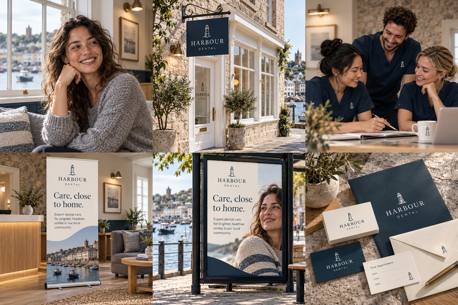
Generated concept imagery throughout. People are fictional, not real staff or patients. All settings and placements are imagined.
01 / THE VISUAL LANGUAGE
Intention in
every detail.
Chalk white, weathered stone, navy and driftwood recall a working harbour and its shoreline. Natural materials give the identity a grounded, local character.
#F3F2EC#A6AAA5#203746#A88D6CAa. A little space
changes the feeling.
Display headlines → clear section titles → plain, readable body copy.
Neighbourly. Clear. Grounded.
02 / DIGITAL FIRST IMPRESSION
A website with
its own rhythm.
A measured serif headline and a clear navy wordmark sit beside coastal imagery. Chalk-white space and warm materials connect the digital experience with the imagined clinic. The interface below is a presentation mockup; its internal controls are illustrative.
Care, close to home.
Start with a conversation.
Bring your questions. Take your time.
Desktop website concept · fictional .example address · no booking service
A familiar welcome, close to home.
Instagram application · illustrative interface, no live account or engagement metrics.
A shared visual language, from the front desk to the team room.
LinkedIn application · illustrative interface, no live account or engagement metrics.
An imagined welcome, from the street to the reception.
Facebook application · illustrative interface, no live account or engagement metrics.
A proposed behind-the-brand film, presented as a still thumbnail.
YouTube application · illustrative interface, no live account or engagement metrics.
04 / FINDING THE BRAND
A coherent arrival.
Illustrative Google search and business-profile appearances. These show visual consistency only, with no real listing, rankings, reviews, location or availability.
harbour.example
Harbour Dental — Care, close to home.
Explore an imagined approach, meet a fictional team and discover the visual world of Harbour Dental.
Harbour Dental
Fictional dental clinic
05 / INTO THE WORLD
From an entrance
to a passing glance.
Stone, warm wood, navy signage and a lighthouse-inspired mark carry the identity from the street to the reception. Every placement below is generated concept imagery; none is an installed campaign.
06 / A BRAND PEOPLE CAN WEAR
A shared identity.
A human presence.
Navy scrubs with small embroidered wordmarks make the brand feel wearable. The scene imagines colleagues collaborating, with natural gestures and everyday warmth.
Generated people, not real staff. No medical credentials, client relationship or clinical results are represented.
KEEP EXPLORING / FOUR OTHER DIRECTIONS